I was watching a presentation the other day, and it occurred to me:Â bad presentations are too easy to make. I remember when I was a kid my dad used an overhead projector for presentations. He would spend hours pored over a desk creating transparencies either by hand or designing the contents for someone in graphics to build. Even before overheads, slides added a whole different level of complexity.
Today, I can cut and paste a presentation in a matter of minutes. I can then print out the slides and have “handout” materials. Then I can walk into a room and bore the life out of the audience. It’s all so easy. Something has gone horribly wrong.
The ease of creation affords the opportunity to create spectacular works. It also allows us to spend less time preparing and organizing our thoughts because we can create tens of slides in less time than it would have taken to create one transparency. While I have several “tips” below, one rule trumps all: “Just because you can doesn’t mean you should.”
How to Make Great Presentations
1. Begin with the end in mind. What is the one thing that you want the audience to know after they’ve heard your presentation? Spending more time on the front end will force you to focus on what you are trying to communicate. Keep the point in mind throughout the whole presentation and reference it multiple times.
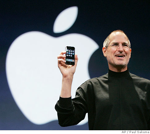
2. Do as much as you can withOUT software. Some of the most effective presentations have very few slides. Never underestimate the power of effectively using props on stage. Watch some of the Steve Jobs’ presentations. He used his products well to emphasize the key point: size of an iPhone or weight of a macbook air.
3. Omit unnecessary, excessive words. It is so easy to write every word on the screen and use it as a teleprompter. Keep each slide succinct and use presenter notes excessively. Personally, I have always found on screen notes to be cumbersome and clunky, so use notecards or print out your notes in advance.
4. More slides, less boredom. Communicate one idea per slide. You may feel the need to back that one idea up with 10 bullet points, but that’s what your mouth is for. This will allow you to keep the words per slide to a minimum–hopefully less than 7 words. Yes, I said “7 words max.”
5. Use great images. Use Creative Commons images or spend a few bucks on royalty free images at BigStock or Getty Images. Either way, great images can add pizzaz to an otherwise mediocre presentation.
6. Keep the focus on you. Â The audience is there to see you (or because they are forced to be there). Either way, you are the main attraction, not your deck. Keep their attention on you.
7. There’s power in pauses. It is tempting and almost obligatory to speak every second. There is, however, power in pausing. Whether emphasizing a point or building anticipation, silence can capture your audience’s attention unlike any other device.
8. Design matters.
- Unless you’re a designer, stick with one font.
- Can you read your slides when viewed at 30%? If you cannot read the slides, then your audience probably won’t be able to read them at 30 ft.
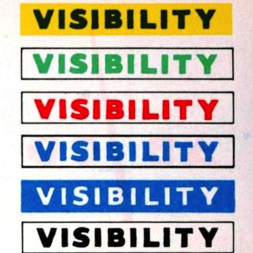
- I’m not going all color theory, but it is important to maintain contrast between the font and the background to increase visibility to your audience.
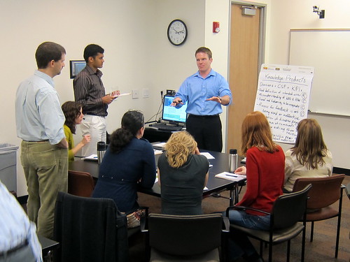
9. Engage your audience. Presentations aren’t lectures. In fact, most lectures shouldn’t be. Engage them and involve them into your presentation. I like to spend a few minutes talking to the audience before the presentation. Inevitably, I can relate one of my slide back to a conversation that I had.
10. How do you get to Radio City Music Hall? Practice. Practice. Practice. Some people practice their presentation 10 times before giving it. Think about the following things when practicing:
- Where are you going to stand or move through your presentation?
- Being comfortable with not filling every second of the presentation with words. Where are the logical pauses?
- Knowing your transitions well.
- Planning for technology failures.
- Watch tons of great presentations at TED.com, and keep a notebook of what works especially well.
Here is a deck on great presentations by Alexei Kapterev called Death by PowerPoint:
Great Presentation Tools
Each venue requires slightly different tools. Here are a few tools to consider in different situations.
1. Keynote – By far Keynote my favorite. From simple animations to beautiful themes, Keynote takes the time and pain out of presentation software. Integration with the iPhone Keynote remote is great, but I wouldn’t count on it for showtime. In addition to the included themes, there are several sources of great presentation themes to provide a well-designed template.
3. Flip Charts – One of the most effective tools for presenting is the simple flip chart. Writing and drawing your points in front of your audience keeps their attention.
4. Google Docs – The tool isn’t much better than PowerPoint but you don’t have to worry with transferring the files. As long as there’s an Internet connection where you’re presenting, you can access and present from any web browser.
5. SlideRocket – SlideRocket has made amazing advances in recent years. This web-based service provides presentation tools, but the “motion graphics” advances make it an interesting tool.
GoAnimate and PowTown provide an interesting animation software.
Final Point on Great Presentations
Great presentations have the power to move your audience to action. No matter whether you have 10 people or 10,000 watching you, they are giving up precious, billable time to listen to you, don’t disappoint them. Respect your audience by doing a killer job, and don’t take the easy way out, ever.
In addition to classroom lectures, I have been delivering presentations for seven years on a broad range of business and marketing topics to a variety of audiences. Yes, the butterflies still start minutes before speaking, and yes my voice still shakes a little bit when I say my first line, but after a while you crave the rush. Don’t sweat the nerves, sweat the content. In less than three minutes into your presentation, the nerves will be gone.
From time to time I coach people who are giving presentations. Feel free to reach out to me or leave a comment if you would like any coaching advice. Good luck!


Pingback: Emerging Ideas - Building The World's Brightest Ideas()
Pingback: 10 Tips to Great Presentations - Jeremy Floyd |...()